Redesigning Notification Center
An exercise in refining a Human Interface
It's become pretty obvious that we have a love hate relationship with Notification Center
The general consensus on the internet is that while the basic functionality of notification center is great – its got some real flaws in visual design and user experience. No one likes the linen – it doesn't make sense. If there's linen behind the screen (seen when you use Siri or the app switcher) then how can you also pull down a curtain of the same material over the screen? Its inconsistent and visually blah.
The second major issue with Notification Center is the tiny little close x buttons that you have to tap twice. The iOS Human Interface Guidelines specify a tap area of 44 pixels2, these are clearly in violation. Tap above or below the x and you'll hit a notification banner. This needs to be painless and really should be a delightful experience.
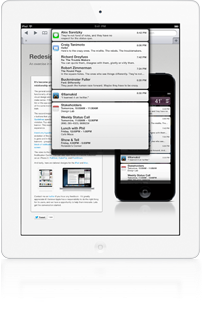
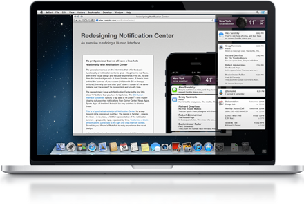
Here's my hypothetical redesign of Notification Center. Its an evolution of the current design not a conceptual overhaul. The linen is gone and in its place, a faithful representation of the notification banners - grouped by App, organized chronologically. To dismiss a block of notifications just swipe to the right and drag them off screen.
The video to the right shows some different ways to reveal Notification Center. You can also view these animations fullscreen on an iPhone 5: PullOver, CubeFlip, and PushDown.
And lastly, here are tailored designs for the iPad and Mac.


Contact me on twitter if you have any feedback - I'd greatly appreciate it! I believe Apple has a responsibility to do the right thing for its users, and we have a opportunity to help them innovate. Lets get the conversation started.
A very special thanks to Jim Dalrymple for linking to this first!
You Rock!